[Must Learning with R_7] Ch9. ggplot2를 활용한 다양한 그래프 그리기
Wikidocs에 올라와있는 Must Learning with R 을 참고하며 방학동안 부족한 R programming 공부를 하고있습니다.
Ch9. ggplot2를 활용한 다양한 그래프 그리기
ggplot2로 그릴 수 있는 그래프들의 종류에 대해 알아보겠습니다.
library(ggplot2)
library(dplyr)

STOCK = read.csv("D:\\uniqlo.csv")

STOCK$Date = as.Date(STOCK$Date)
STOCK$Year = as.factor(format(STOCK$Date,"%Y"))
STOCK$Day = as.factor(format(STOCK$Date,"%a"))


Group_Data = STOCK %>%
  group_by(Year, Day) %>%
  dplyr::summarise(Mean = round(mean(Open)),
                   Median = round(median(Open)),
                   Max = round(max(Open)),
                   Counts = length(Open)
                   )
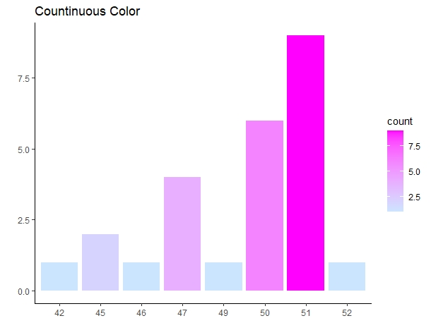
A1. Bar Chart(막대그래프)
막대도표는 가장 기본적인 그래프
하나의 이산형 변수를 기준으로 x축 변수 1개로만 그리는 경우
ggplot(Group_Data) +
  geom_bar(aes(x = as.factor(Counts), fill = ..count.. )) +
  xlab("") + ylab("") +
  scale_fill_gradient(low = "#CCE5FF", high = "#FF00FF") +
  theme_classic() + ggtitle("Countinuous Color")
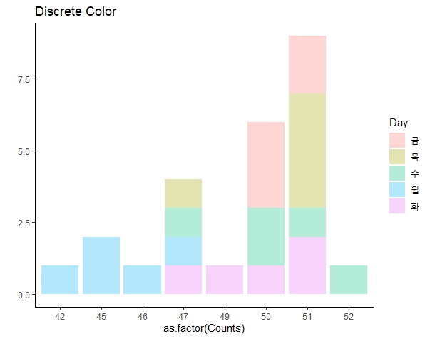
Group_Data %>%
  ggplot() +
  geom_bar(aes(x = as.factor(Counts), fill = Day), alpha = 0.3) +
  ylab("") + ylab("") +
  theme_classic() + ggtitle("Discrete Color")
색 구분 포지션을 변경하고 싶은 경우
ggplot(Group_Data) +
  geom_bar(aes(x = as.factor(Counts), fill = ..count.. )) +
  xlab("") + ylab("") +
  scale_fill_gradient(low = "#CCE5FF", high = "#FF00FF") +
  theme_classic() + ggtitle("Countinuous Color")
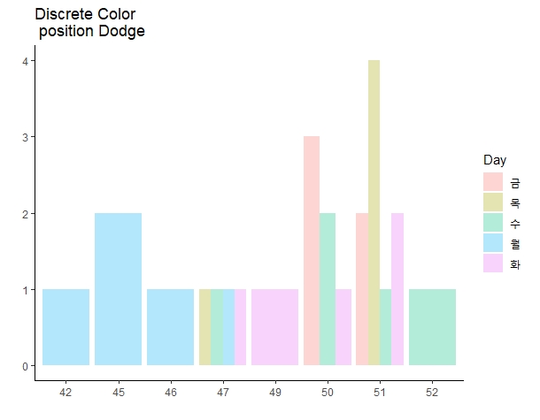
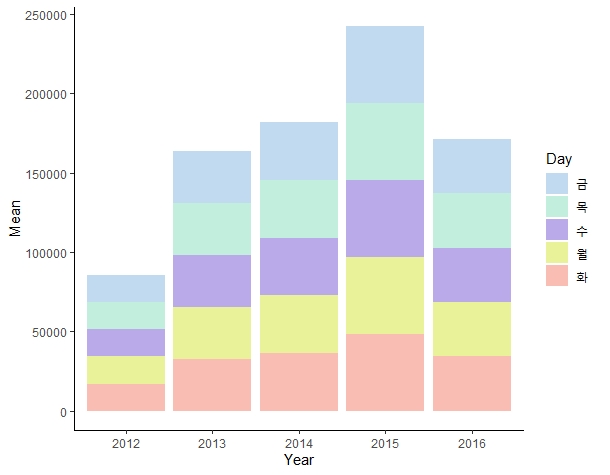
x축, y축 1개씩 총 변수 2개로 그리는 경우, stat=’identity’를 사용합니다.
ggplot(Group_Data) +
  geom_bar(aes(x = Year, y=Mean, fill = Day), stat = 'identity') +
  scale_fill_manual(values = c("#C2DAEF","#C2EFDD","#BBAAE9",
                               "#E9F298","#FABDB3")) +
  theme_classic()
A2. Histogram (히스토그램)
연속형 변수를 시각화
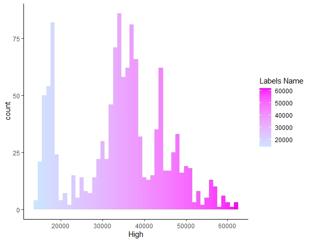
ggplot(STOCK) +
  geom_histogram(aes(x = High, fill = ..x..),
                 binwidth = 1000) +
                 #binwidth : 히스토그램의 변수 구간을 조정
  scale_fill_gradient(low = "#CCE5FF", high = "#FF00FF") +
  theme_classic() + labs(fill = "Labels Name")
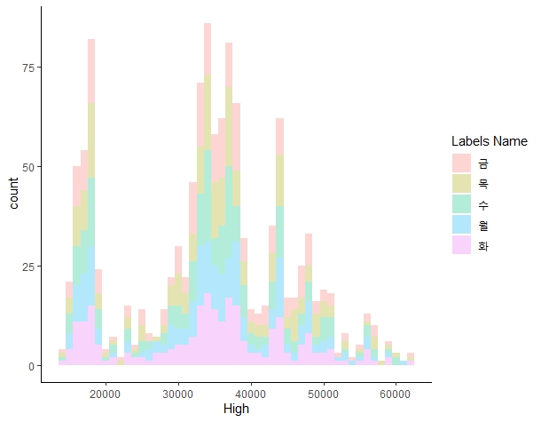
ggplot(STOCK) +
  geom_histogram(aes(x = High, fill =Day),
                 binwidth = 1000, alpha = 0.3) +
  theme_classic() + labs(fill = "Labels Name")
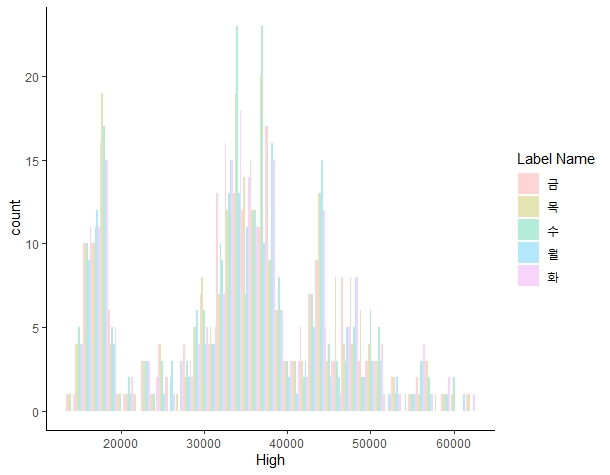
ggplot(STOCK) +
  geom_histogram(aes(x = High, fill = Day),
                 binwidth = 1000, alpha = 0.3, position = "dodge") +
  theme_classic() + labs(fill = "Label Name")
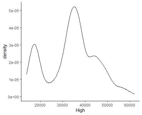
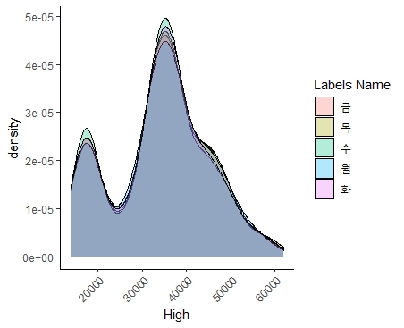
A3. Densitiy plot
히스토그램과 비슷하게 작성. 그래프 면적이 각각의 비율이 되도록 맞춘다.
ggplot(STOCK) +
  geom_density(aes(x = High)) +
  theme_classic() + labs(fill = "Labels Name")
ggplot(STOCK) +
  geom_density(aes(x = High, fill = Day) , alpha = 0.3) +
  theme_classic() + labs(fill = "Labels Name") +
  theme(axis.text.x = element_text(size = 9, angle =45,
                                   hjust = 1))
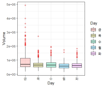
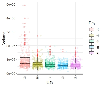
A4. Boxplot and Jitter plot
- 박스플롯은 데이터를 요약하는데 있어 매우 유용한 그래프. 상자의 밑변, 윗변은 각각 1, 3분위수를 의미. 상자를 감싸는 테두리는 울타리라고 하며 이 선을 벗어나면 이상치(Outlier)라 한다.
- 박스플롯을 그리기 위해서 x축은 descrete 변수를 ,y 축에는 continuous 변수를 배치
ggplot(STOCK) +
  geom_boxplot(aes(x = Day, y= Volume, fill =Day),
               alpha = 0.3, outlier.color = 'red') +
  theme_bw()
ggplot(STOCK) +
  geom_boxplot(aes(x = Day, y = Volume, fill = Day),
               alpha = 0.2, outlier.color = 'red') +
  geom_jitter(aes(x = Day, y= Volume, col = Day), alpha = 0.1) +
  theme_bw()
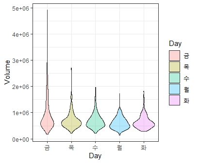
A5. violin plot
박스플롯과 비슷한 역할을 수행
ggplot(STOCK) +
  geom_violin(aes(x = Day, y= Volume, fill = Day),
              alpha = 0.3 ) +
  theme_bw()
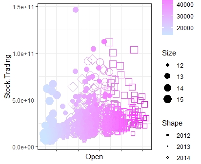
A6. Scater plot
산점도는 데이터 상관관계를 파악하기에 유용한 그래프. 그래프에서 shape, size 등을 통해 다양한 그래프를 그릴 수 있음.
ggplot(STOCK) +
  geom_point(aes(x = Open, y = Stock.Trading,
                 col = High, size = log(Volume), shape = Year)) +
  scale_color_gradient(low = "#CCE5FF", high =  "#FF00FF") +
  scale_shape_manual(values = c(19,20,21,22,23)) +
  labs(
    col = "Color", shape = "Shape", size = "Size"
  ) +
  theme_bw() +
  theme(axis.text.x = element_blank())
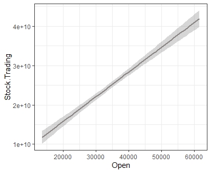
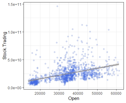
A7. Smooth plot
geom_smooth는 회귀선을 그려줌
ggplot(STOCK) +
  geom_smooth(aes(x = Open, y = Stock.Trading),
              method = 'lm',
              col = '#8A8585') +
  theme_bw()
ggplot(STOCK) +
  geom_point(aes(x = Open, y = Stock.Trading, ),
             col = 'royalblue', alpha = 0.2) +
  geom_smooth(aes(x = Open, y = Stock.Trading),
              method = 'lm', col = '#8A8585') +
  theme_bw()
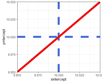
A8. bline, vline, hline
그래프에 평행선, 수직선, 대각선을 그릴 수 있는 명령어
ggplot(NULL) +
  geom_vline(xintercept = 10, linetype = 'dashed',
             col = 'royalblue', size =3) +
  geom_hline(yintercept = 10, linetype = 'dashed',
             col = 'royalblue', size =3) +
  geom_abline(intercept = 0, slope =1, col ='red',
              size =3) +
  theme_bw()
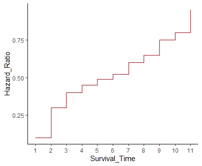
A9. Step plot
계단형식의 그래프. 값의 증가량을 나타낼 때 효과적
Hazard_Ratio = c(0.1,0.3,0.4,0.45,0.49,0.52,0.6,0.65,0.75,0.8,0.95)
Survival_Time = c(1,2,3,4,5,6,7,8,9,10,11)

ggplot(NULL) +
  geom_step(aes(x = Survival_Time , y = Hazard_Ratio), col = 'red') +
  scale_x_continuous(breaks = Survival_Time) +
  theme_classic()
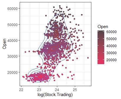
B1. Density 2d plot
밀도그래프를 2개의 차원으로 그리는 그래프.
ggplot(STOCK) +
  geom_point(aes(x = log(Stock.Trading), y = Open, col = Open)) +
  geom_density2d(aes(x = log(Stock.Trading), y = Open)) +
  scale_color_gradient(low = "#E93061", high = "#574449") +
  theme_bw()
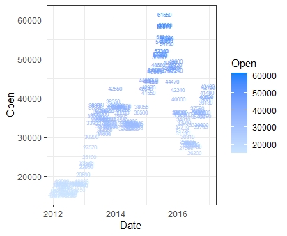
B2. Density 2d plot
산점도와 거의 동일. 다만 점이 아닌 지정한 글자로 그래프를 그리는 방식
SL = sample(1:nrow(STOCK), 200, replace = FALSE)

ggplot(STOCK[SL,]) +
  geom_text(aes(x = Date, y = Open, label = Open,
                col = Open), size = 2) +
  scale_color_gradient(low = "#CCE5FF", high = "#0080FF") +
  theme_bw()
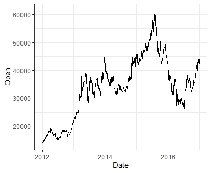
B3. Line plot & Timeseries plot
선 그래프에서는 group이라는 옵션이 필요.
ggplot(STOCK) +
  geom_line(aes(x = Year, y=Open), group = 1) +
  theme_bw()
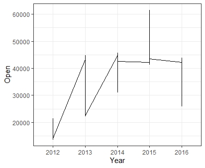
선은 동일한 x에서 하나의 y 값만을 가져야 하는 특징이 있으므로 이 선 그래프는 잘못 그려진 경우이다. 따라서 선 그래프를 그리기 전에는 항상 이 점을 유의해 요약값을 만들어준 후 그래프를 작성해야 함.
ggplot(STOCK) +
geom_line(aes(x = Date, y = Open), group = 1) +
theme_bw()
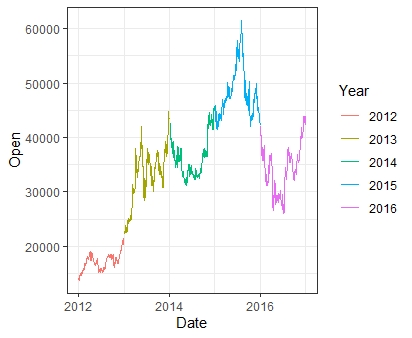
ggplot(STOCK) +
geom_line(aes(x = Date, y = Open,
col = Year, group = Year)) +
theme_bw()
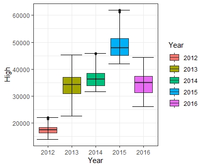
B4. Error bar plot
- 우리가 직접 범위를 조정할 수 있는 오차범위 그래프.
- 일반적으로 point, boxplot과 혼합할 때 주로 쓰인다.
DF = STOCK %>%
  group_by(Year) %>%
  summarise(Min = min(High),
            Max = max(High))

ggplot(NULL) +
  geom_boxplot(data = STOCK, aes(x = Year, y = High, fill = Year)) +
  geom_errorbar(data = DF, aes(x = Year, ymin = Min, ymax = Max)) +
  theme_bw()
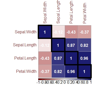
B5. Corrplot
상관계수를 히트맵 형식으로 한 그래프
Cor_matrix = cor(iris[,1:4])

install.packages('corrplot')
library(corrplot)

corrplot(Cor_matrix , method = "color", outline = T, addgrid.col = "darkgray",
         order="hclust", addrect = 4, rect.col = "black",
         rect.lwd = 5,cl.pos = "b", tl.col = "indianred4",
         tl.cex = 1, cl.cex = 1, addCoef.col = "white",
         number.digits = 2, number.cex = 1,
         col = colorRampPalette(c("darkred","white","midnightblue"))(100))
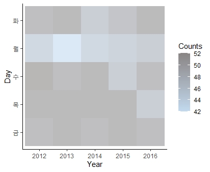
B6. Heatmap
- 위 Corrplot과 비슷한 형태의 그래프
- 원하는 값을 기준으로 색의 온도를 나타낼 수 있다.
ggplot(Group_Data) +
  geom_tile(aes(x = Year, y = Day, fill = Counts), alpha = 0.6) +
  scale_fill_gradient(low = "#C2DAEF", high = "#8A8585") +
  theme_classic()
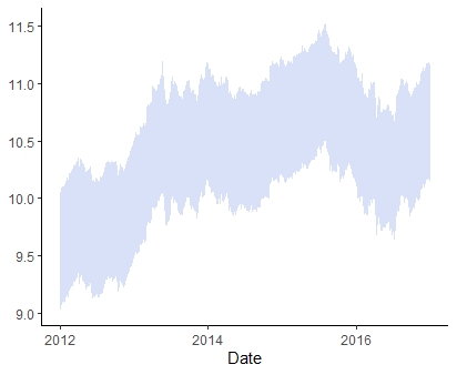
B7. Ribbon plot
범위를 정할 수 있는 선 그래프
ggplot(STOCK) +
  geom_ribbon(aes(x= Date, ymin = log(Low) - 0.5,
              ymax = log(High) + 0.5),fill = 'royalblue' , alpha = 0.2) +
  theme_classic()
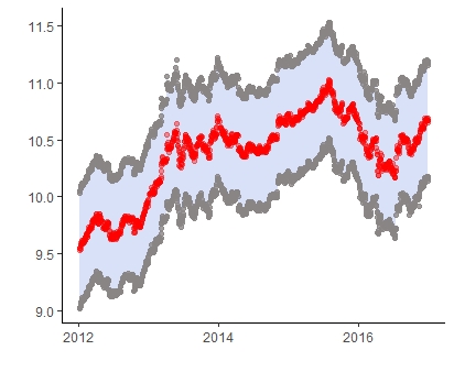
ggplot(STOCK) +
  geom_ribbon(aes(x= Date, ymin = log(Low) - 0.5, ymax = log(High) + 0.5),fill = 'royalblue' , alpha = 0.2) +
  geom_point(aes(x= Date, y = log(Low) - 0.5), col = '#8A8585', alpha = 0.8)  +
  geom_point(aes(x= Date, y = log(High) + 0.5), col = '#8A8585', alpha = 0.8) +
  geom_line(aes(x = Date, y = log(Open)),group =1 , col = '#C2DAEF' ,  linetype = 'dashed', size  = 0.1) +
  geom_point(aes(x = Date, y = log(Open)),col = 'red', alpha = 0.4) +
  theme_classic() +
  ylab("") + xlab("")
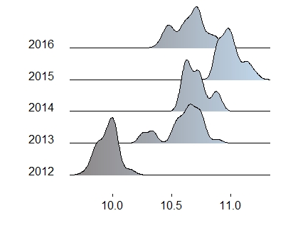
B8. Ridge plot
density plot을 여러개 그릴 수 있는 그래프
install.packages('ggridges')
library(ggridges)

ggplot(STOCK) +
  geom_density_ridges_gradient(aes(x = log(High) + 0.2 ,
                                y= Year, fill = ..x..),gradient_lwd = 1.) +
  theme_ridges(grid = FALSE) +
  scale_fill_gradient(low= "#8A8585", high= "#C2DAEF") +
  theme(legend.position='none') + xlab("") + ylab("")
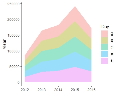
B9. Area plot
누적값을 나타내는 영역 그래프
ggplot(Group_Data) +
  geom_area(aes(x= as.numeric(as.character(Year)),
               y = Mean , fill = Day ),alpha = 0.4) +
  theme_classic() +
  xlab("")
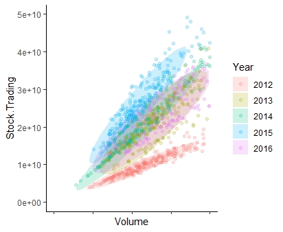
C1. Polygon plot
그래프분포의 범위를 나타내느 그래프
ggplot(STOCK) +
  stat_ellipse(geom = 'polygon',
               aes(x = Volume, y = Stock.Trading, fill = Year), alpha = 0.2) +
  geom_point(aes(x = Volume, y = Stock.Trading, col = Year),
             alpha = 0.2) +
  theme_classic()  +
  # 그래프 가시성을 위해 축 범위 조절
  xlim(0,1000000) + ylim(0,50000000000) +
  theme(axis.text.x = element_blank())
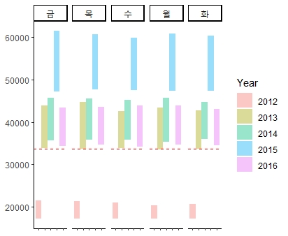
C2. Rect plot
사각형 형태의 그래프. 주로 waterfall 그래프를 그리는데 활용됨
ggplot(Group_Data) +
  geom_rect(aes(xmin = as.numeric(as.character(Year)) - 0.5 ,
                xmax = as.numeric(as.character(Year)) + 0.5,
                ymin = Median, ymax = Max, fill = Year), alpha = 0.4) +
  geom_hline(yintercept = mean(Group_Data$Median),
             linetype = 'dashed', col = 'red') +
  theme_classic() +
  facet_wrap(~Day, nrow = 1) +
  theme(axis.text.x = element_blank())